TimeJump
Timejump
Background
A business known as Global-Corp has recently taken a charitable initiative to help more children learn history. To accomplish this goal Global-Corp has donated a smartphone to every child within a given school, and equipped the smartphone with a time traveling app.
The Challenge
Design an app to facilitate hands-on learning for children aged 10-12 by allowing them to travel through time and space.
Tools Used
Adobe Illustrator CC
Adobe Photoshop CC
Adobe XD CC
Adobe Color CC
UXPressia
Wires UI Kit
Stock Illustration, Photos & Icons
Pencils, Pens & Paper
User Research
Ok, first things first. Who are we designing for?
Time was limited for this project, but lucky for me I have a few great 10-12 year olds in my inner-circle. I was able to profile them, and came up with a persona to help me gauge the needs of my mobile app.
Based on my "Sarah" persona, I determined some important factors for this student demographic:
In the internet age, kids have so many different ways available to them to receive knowledge.
The fast-paced "media blitz" that surrounds them impacts their ability to spend long timeframes focused on singular subjects through singular delivery methods.
Quick gratification is the way to go.
Gamification is a great tool to keep their focus. It fosters competition and provides them a positive emotional boost.
Social connectivity is everything. They want to remain connected to friends and their social network as often as possible.
This information was key in helping me prioritize features and interface components.
Meet Sarah.
Reviewing the Competition
In order to fully appreciate the need for an educational, historical time traveling app, I needed to understand the competition. Surely there were apps already in the market place with similar capabilities. I made it my goal to understand those apps, their strengths, and gaps in functionality.
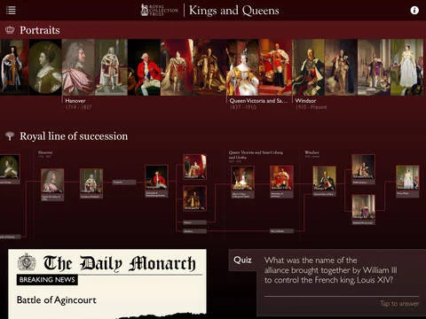
Kings & Queens
This is a richly-styled app, which is focused on teaching students about famous monarchs. It provides a deep-dive into European royal bloodlines and relies on photo-heavy content.
Pros
In-depth information within historical domain
Intuitive browsing workflow fosters exploration
Timeline-based content layout provides context to users
Cons
Age-inappropriate UI styling plays to an older crowd
Content is too specific, focused solely on medieval monarchies
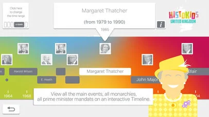
HistoMaster UK
This one is a quiz game, which provides a quick entrance into UK history. It allows the user to answer a handful of questions each day for free before requiring an app purchase.
Pros
Brightly-colored for kids
Whimsical Margaret Thatcher avatar
Cons
Timeline layout is confusing
Content is too specific, focused solely on UK history
GCSE History
This app provides English students with a study guide to help them learn specified subject material. The purpose of this workflow is to help them pass a mandatory test.
Pros
Interface is fun, clean and easy to use
Custom quizzes to prepare students for a greater challenge
Cons
Rigid quiz workflow and content prohibits exploration
App adoption is short-lived, and ends when test is passed
Ideation
As I do with any new project, I spend a decent chunk of time at the very beginning simply letting the ideas flow. I write them down or type them out to record them. In this case, I used Microsoft Word, but I have had equal success with post-its, or even on a napkin in a restaurant.
When recording ideation notes, I like to keep the descriptions very short and high-level. I love the process of rapid ideation, and always feel a sense of excitement allowing myself to jump between ideas. I do my best to not self-edit during this stage, and allow myself the time to think outside of the box.
You never know what innovative idea is lurking just beyond the next thought.
How can I keep the kids engaged?
The more I thought through the unique challenges for this product, and the demographic it serves, the more I realized how difficult adoption would be for pre-teens. They are constantly flooded with rapidly changing media, and attention spans don't last long at that age. The only way to keep them truly engaged would be to match this experience to the ones that they choose to engage in every day.
I decided to create a wide variety of ways for the user of this application to access all types of educational material. People have preferences for methods to find information anyways, but in this case I thought I could also reduce boredom by giving the student users a constant, rapidly-changing method of accessing new information.
I made the choice to include various methods of searching and browsing for material, as well as cognitive suggestions based on user behavior.
To go one step further, I also included a gamification component to play into competitor/collector personality types. I included a challenge feature, which would offer digital badges as prizes for challenge completion. Users can collect badges and compete against each other. Teachers would also have integrations into the enterprise features for this app, to build quizzes and tie app content to state-mandated curriculums.
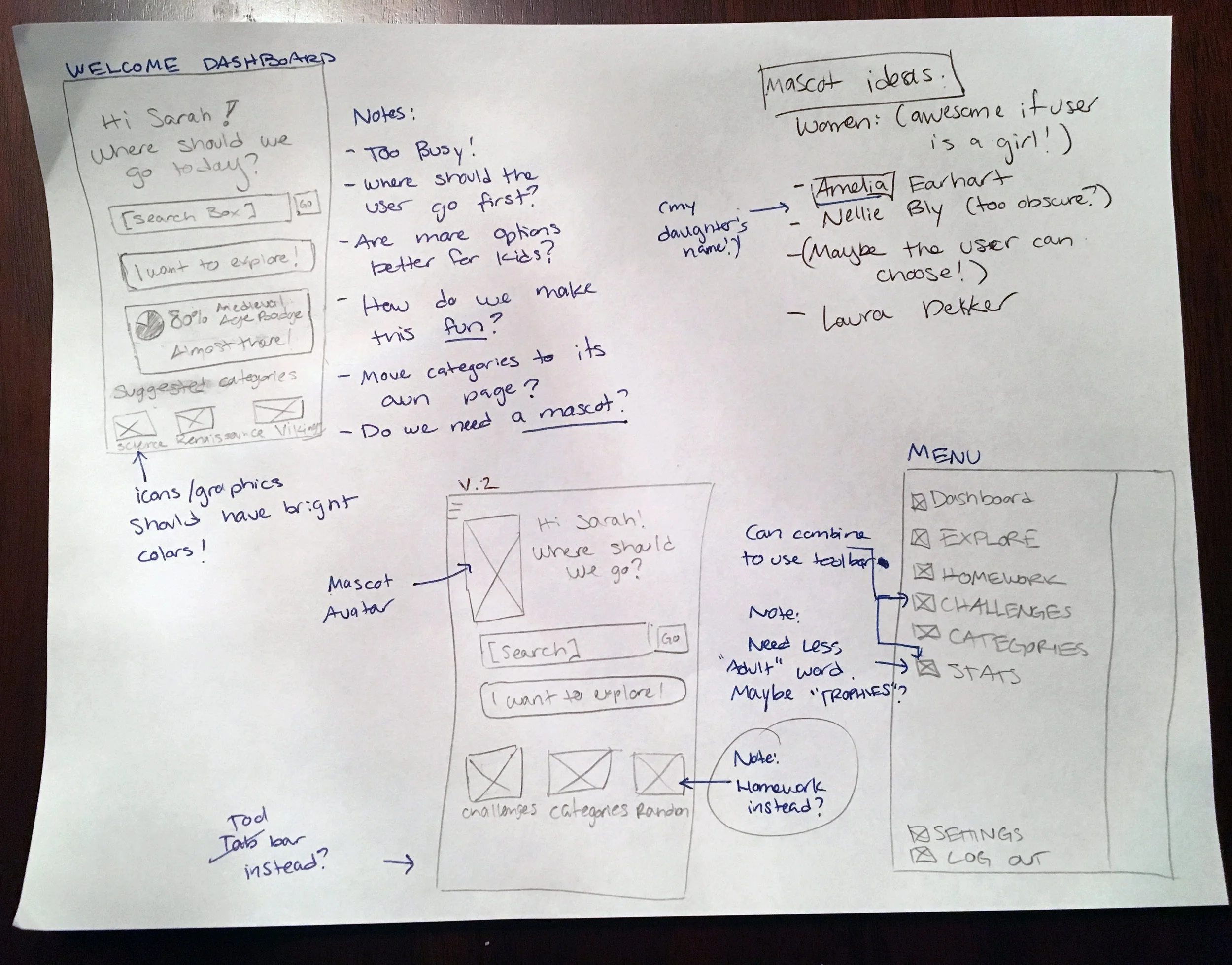
Sketches
Inspiration for this product flowed freely, so I only needed a handful of sketches to get started. I was able to move into the wireframing phase fairly quickly.
Even though I didn't feel that I needed to do many sketches for this project, spending a little time putting some together was extremely helpful for the more complex screens.
Taking a little bit of time for these screen sketches ultimately helped to save me time up further down the road.
Wireframes
By the time I got to wireframing, my brain was exploding with ideas. I love the wireframing stage, because it allows me to validate the ideas in my head. That said, it can sometimes be a little time-consuming. I didn't want to lose the energy that I felt during the ideation stage.
To keep my momentum up, I looked to pre-made wireframing kits to do the tedious details for me. I found the Adobe Wires kit for Adobe XD CC, and it was an easy fit. I used the building blocks from the kit to accomplish the first 80% of the wireframing process.
The remaining components were simply easy modifications of existing symbols or quick new symbol creation. All-in-all, the wireframe design stage was a great experience and an efficient process.
Interactions & Flowchart
With wireframes completed, I really wanted to draw up a flowchart to give my screens some context. With so many different discovery points and methods of navigation, I wanted to layout a clear view of workflow paths and needed interactions.
Branding & Visual Standards
To start the branding portion of this project, I spent a little time thinking through potential product names. I had a LOT of bad ones (I even contempated "Historiapp"... terrible), and a few that were ok, but didn't quite hit the mark. After some brainstorming with a dear friend in marketing, I landed on "TimeJump". There weren't any significant existing apps with that name, and it told the time travel story I wanted to tell. Even better, it fit as a feature name for my timeline wheel concept!
Color Palette
I wanted to create a vibrant, colorful, visually stimulating interface for this product. Based on the Sarah persona I hypothesized that the student users would not only prefer a highly-colorful interface, but would actually need one. One of the largest pain points of traditional history lessons is that they can be boring and long-winded, especially for kids of the digital age.
I wanted to create an interface with contrasting colors, and constantly changing palettes with each page. This sort of an experience would be jarring to many adults, but would fit in well amongst the onslaught of rapidly-changing media that 10-12 year olds voluntarily consume all day long.
Graphical Elements
Mascot Avatar
In addition to bright colors, I wanted to include a component of age-appropriate illustration to the interface. I came up with the idea of having a "mascot" to accompany them throughout their learnings in the app.
I didn't want it to feel like Microsoft's "Clippy" character, but I felt it could add a fun element. I decided to go one step further, and allow these mascots to be historical figures.
I wanted a female mascot since my persona was a young girl. It felt warmer and more relatable to the user, by giving her a female role model figure. I chose Amelia Earhart - she's a favorite of mine, and it helps that my daughter's name is Amelia too. (I like sneaking personal touches like that into my work.)
Amelia Earhart Illustration
Normally, I would want to build my own illustration from the ground up. I enjoy the process, but time was far too limited here. I found a great starter illustration from Freepik, and worked to modify it to what I needed it to be.
Icons
My UI turned out to be really icon-heavy, and I wanted icons that would really stand out and have personality. Trendy flat, line-drawn icons wouldn't work.
I found a series of great, free icon sets from Manuela Langella, which turned out perfectly in the final designs.
Font & Logo
Typography is so important to setting the correct tone for a product. It needs to be age and content appropriate. And to be perfectly honest, I had no idea what fonts would appeal to 10-12 year old students. I was worried I would aim too young, and accidentally make something that was too cartoonish for these users.
Internet to the rescue! i researched some recommended fonts for pre-teens, and gave a few of my favorites a whirl. Looking at them side-by-side made the correct choice jump straight out.
From there, I converted the font into a shape and worked on modifying it to be a truly stylized logo.
Mockups
With all of my research, branding and workflows done mockups came along pretty organically. It was nice to explore designing something with an entirely different look and feel.


